Turnaround
Providing child care in a different way to the competitors
Turnaround
Providing child care in a different way to the competitors

Project
Idea
Try something different
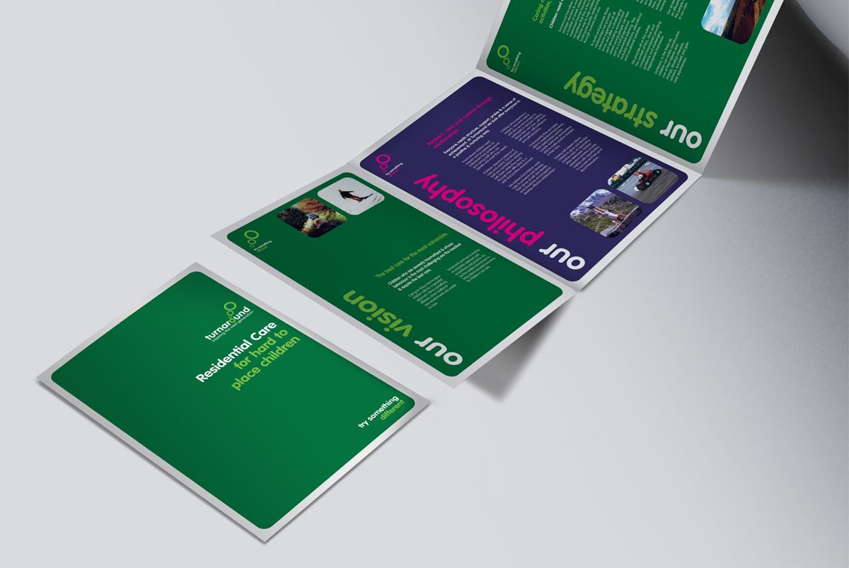
Turnaround required a complete branding overhaul. Focussing ideas on Turnaround's vision of providing child care in a different way to it's competitors, the strapline 'try something different' was introduced.
Try something different
Turnaround required a complete branding overhaul. Focussing ideas on Turnaround's vision of providing child care in a different way to it's competitors, the strapline 'try something different' was introduced.
Try something different
Turnaround required a complete branding overhaul. Focussing ideas on Turnaround's vision of providing child care in a different way to it's competitors, the strapline 'try something different' was introduced.
Try something different
Turnaround required a complete branding overhaul. Focussing ideas on Turnaround's vision of providing child care in a different way to it's competitors, the strapline 'try something different' was introduced.

Identity
Identity
Let's do the branding differently too then
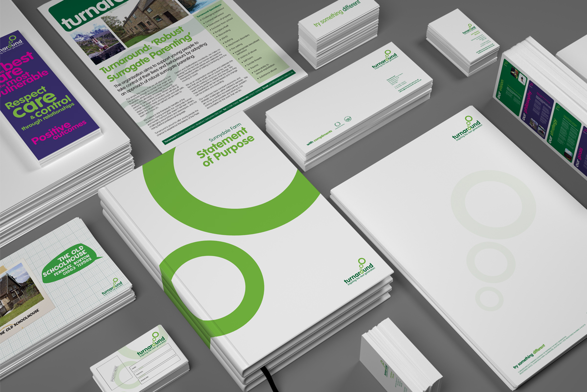
In a sector full of stuffy, old-fashioned logos, we introduced a vibrant green primary colour palette that reflected the amount of outdoor activities the young people participate in and a rounded typeface that was more age appropriate to the group cared for.


Identity roll-out
Identity
A complete overhaul
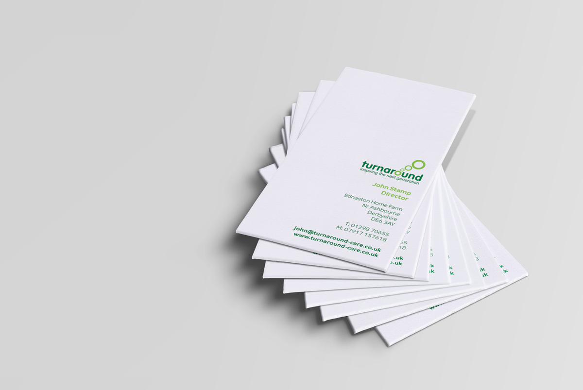
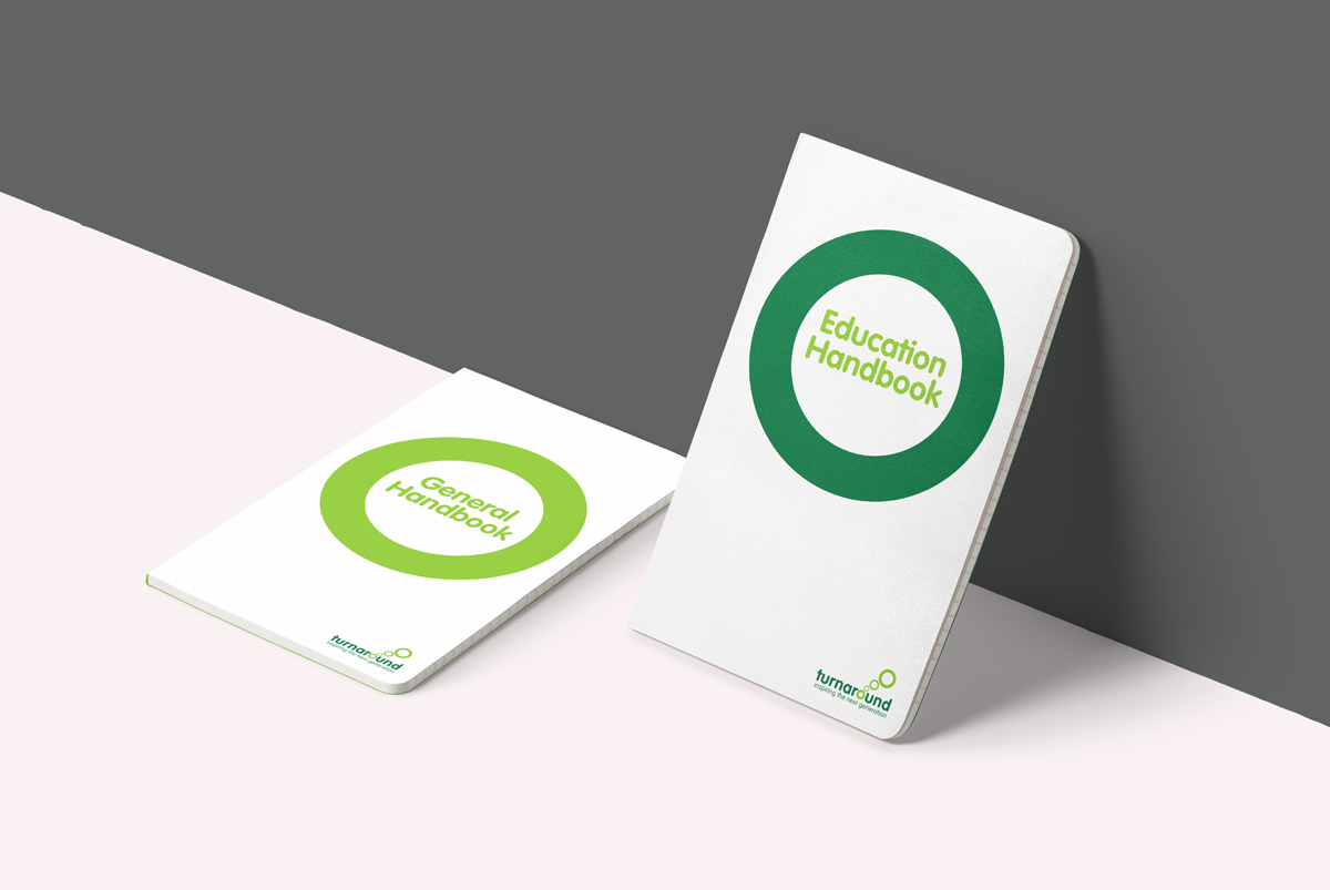
From legal documents and name badges, to magazine ads, exhibition stands and even Landrover liveries, the branding was applied everywhere.
A complete overhaul
From legal documents and name badges, to magazine ads, exhibition stands and even Landrover liveries, the branding was applied everywhere.
A complete overhaul
From legal documents and name badges, to magazine ads, exhibition stands and even Landrover liveries, the branding was applied everywhere.
A complete overhaul
From legal documents and name badges, to magazine ads, exhibition stands and even Landrover liveries, the branding was applied everywhere.
A complete overhaul
From legal documents and name badges, to magazine ads, exhibition stands and even Landrover liveries, the branding was applied everywhere.


Copyright © 2024 Emma Fairbrother Design and Illustration
